These are my options for my heading font. I wanted something sinister and bold to get across the sort of music you would be reading about. Here were the options;
I'm happy with my choice of font because I think its curvy and nice to look at. But at the same time you can read what it says. I was going to use the one which looks like glass shattering, but I wanted to do something a bit more individual, and several other people would most likely pick this type of lettering. This is not what my magazine was supposed to be about so I decided to pick something thats different to other peoples choices.
Monday, 30 November 2009
Monday, 9 November 2009
Preliminary task
Here is the preliminary task I was given. I was supposed to make a magazine cover and contents page for an imaginary School magazine, to get used to the process you need to go through to get to the finished product. We did the preliminary task in a very short ammount of time so the finished thing didn't come out as well as I'd planned but it still came out okay. As far as my front cover went, I thought it came out quite well because it looked like how I imagined it to look. I think the font colours however, don't stand out very well, so if I was to go back and changed it I would possibly make it a darker colour that would srand out more. The cover photo was quite good I think, but the three pictures at the side don't match with the picture. The bottom one of the three pictures does match only purely because it is musical. If I changed it I would put that one in the middle so that the other two were matched each other, but not matching the cover photo.
This contents page in my opinion let the front cover down. It doesn't have anything on it. If I had enough time I would delete it and do it all again. It just doesn't look like a real contents page. I would of done more research to see what contents pages look like then done it. This one was a bit rushed.
Monday, 2 November 2009
Concert Photographs
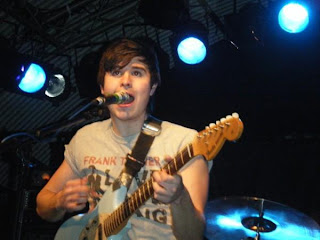
I did this pictures to start off with, because I wanted to see what some pictures would look like if they were at gigs and what the lighting would be like. In some of these pictures they turned out quite well, and they weren't too dark. Some of them came out far too dark and you can't really tell what its a picture of. I think generally it would be unwise to put a picture of a concert as your front cover because its too natural, and the picture isn't really planned. If you plan your picture properly it will come out how you expected it too. But if its not planned theres a variety of things that could go wrong.
Subscribe to:
Posts (Atom)