To start off on this cover, notice how the front cover picture is over the E on NME. This is fairly unusual, but in this case, you have to point out that NME is a quite well known magazine. So the only reason the picture would be over the letter is because people will recognise it if they saw it anyway. Also on this, all the fonts are exactly the same. They might be different colours but the fonts are still the same. I think this gives the cover quite an ordered feel too it. The title has a different font, but its been like that for years, and too change it now would be strange. The person on the background is looking at the camera, but he is not quite smiling but he still looks happy. If you research the actual person, which is Morrissey, you will find out that he is usually quite a broody man so they need to keep that essence on the page.
It says on under "Morrissey", "The Mozfather is back at his shocking best". This says to me that he is well known talented person who everyone who knows music will love. Mozfather is like the God father. In the films, the term "The Godfather" would be someone to fear but lots of people gave respect to. Thats what Morrissey is in the music industry.
The main font colour on the front is yellow. But I think thats true for most of the covers for NME. Its like the signature font colour for the NME.
Theres quite a lot of information on the front of the magazine. It looks quite busy in my opinion. On my cover I would want to have less information on it to make it more intriguing.
Again on this front cover it seems that one of the heads is over the picture instead of behind, which means, again it is a well known brand of magazine.
The theme colour on this magazine seems to be red. Apart from these little bursts of red, generally the rest of it seems to be black and white. Also the main cover photo, it goes black, white, black in terms of clothing. Also this works because if you look at their hair you will see that it goes from a gingerish type colour, brown to ginger again. Its a sort of balanced colour page. The colours on the page would appeal more to people, of the rock/indie/goth etc. persuasion.
The phrase "unfold the puzzle of life..." would be a something that would really catch your eye. The ellipsis at the end make it feel more mysterious.
The cover photo fits nicely into the "rule of thirds". Theres is a clear divide between them all. The centre person fits into the centre box
Friday, 4 December 2009
Proposal
My orignal proposal, was to focus mainly on the women in rock. However, that didn't work out because the girls who would read it, like reading about the men in rock as well as women.
My new idea, was to look at the bands who would appeal mostly to the age of 15- 18. For example, bands like Madina Lake and You Me At Six. Things that would appeal more to kids who listen to heavy metal.
Outcome of photoshoot plan
My plan for my photoshoot didn't come off the way I wanted it too. The ideas I had couldn't come into action. So I decided to go take pictures from some concerts that I went to.
Survey feedback I recieved
1) Would you like to see a magazine that is devoted purely to women?
Most of the people I asked about this, said that they liked they idea of magazines for men that women could read also. So I thought that maybe my original idea probably wasn't the best one.
2) If you had choices of names would rather go for ones like kerrang or normal ones like NME?
The majority of the answers came back saying, that ones like Kerrang were interesting but its nice to have a definate idea of what the magazine has in it. NME, says that its a widely spread musical genre magazine. well kerrang isn't really clear.
3) What do you want a magazine to tell you about music?
People, said that they would like to know whats new in the music industry, tours, and about the singers interests. I thought that this was a bit less than what is in actual magazines. This was quite intriguing. It seems like these days magazines put a lot more in their magazines than people actually want to know.
4) Is women and rock a good way to go in terms of buying it?
Several of the people I asked said that it was a nice idea, however they themselves wouldn't buy it.
In conclusion to this I had to completely re think my whole aspect of my magazine. My original idea wasn't the best one but I now know not what to do.
Monday, 30 November 2009
Heading Fonts
These are my options for my heading font. I wanted something sinister and bold to get across the sort of music you would be reading about. Here were the options;
I'm happy with my choice of font because I think its curvy and nice to look at. But at the same time you can read what it says. I was going to use the one which looks like glass shattering, but I wanted to do something a bit more individual, and several other people would most likely pick this type of lettering. This is not what my magazine was supposed to be about so I decided to pick something thats different to other peoples choices.
Monday, 9 November 2009
Preliminary task
Here is the preliminary task I was given. I was supposed to make a magazine cover and contents page for an imaginary School magazine, to get used to the process you need to go through to get to the finished product. We did the preliminary task in a very short ammount of time so the finished thing didn't come out as well as I'd planned but it still came out okay. As far as my front cover went, I thought it came out quite well because it looked like how I imagined it to look. I think the font colours however, don't stand out very well, so if I was to go back and changed it I would possibly make it a darker colour that would srand out more. The cover photo was quite good I think, but the three pictures at the side don't match with the picture. The bottom one of the three pictures does match only purely because it is musical. If I changed it I would put that one in the middle so that the other two were matched each other, but not matching the cover photo.
This contents page in my opinion let the front cover down. It doesn't have anything on it. If I had enough time I would delete it and do it all again. It just doesn't look like a real contents page. I would of done more research to see what contents pages look like then done it. This one was a bit rushed.
Monday, 2 November 2009
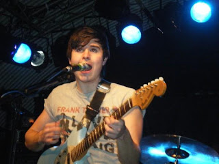
Concert Photographs
I did this pictures to start off with, because I wanted to see what some pictures would look like if they were at gigs and what the lighting would be like. In some of these pictures they turned out quite well, and they weren't too dark. Some of them came out far too dark and you can't really tell what its a picture of. I think generally it would be unwise to put a picture of a concert as your front cover because its too natural, and the picture isn't really planned. If you plan your picture properly it will come out how you expected it too. But if its not planned theres a variety of things that could go wrong.
Subscribe to:
Posts (Atom)